During usability testing participants loved the simplified view of their appointments. They appreciated how clearly the sections were labeled, and how easily they could find what they needed. And when an influx of new users started using the tool, positive feedback significantly increased.
Background
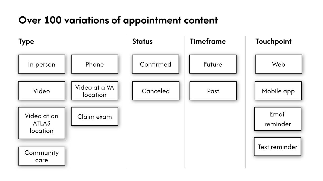
Users needed to be able to quickly understand all of their appointments, though each of the 9 types we showed included different content and status variations. Whether in-person, over telehealth, or through the community, each appointment might have different instructions on how to join, where to go, or, after the appointment, how to file for travel pay or access your after-visit summary.
There were over 100 variations across the 9 overall types. Data had been added to each type over time, so there was no easy to understand structure across types.
My work
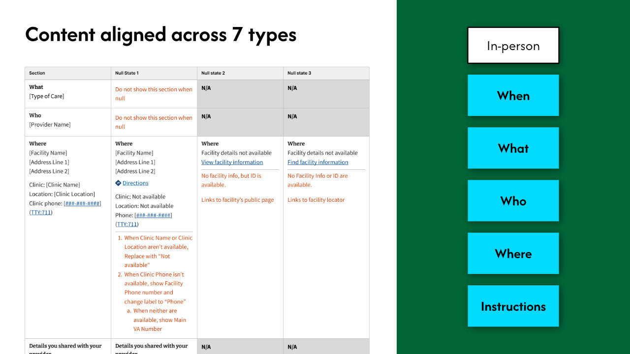
To make this easy to use, the language and structure needed to be consistent whether they appeared on the web, the mobile app, or in an email notification.
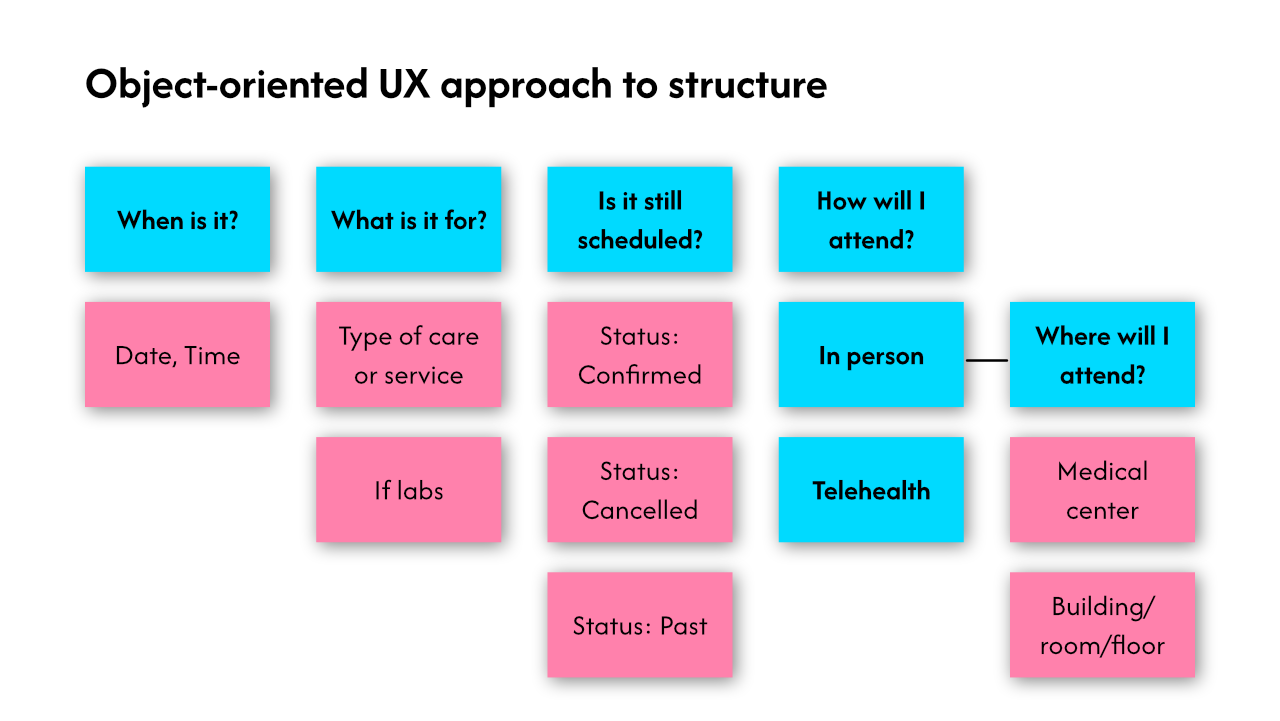
To accomplish this, I reviewed existing research to develop an appointment model. I then ran an object-oriented UX (OOUX) workshop with SMEs, stakeholders, and content specialists to define consistent types. I tested this model in multiple usability studies to make sure that it made sense to Veterans.
Outcome
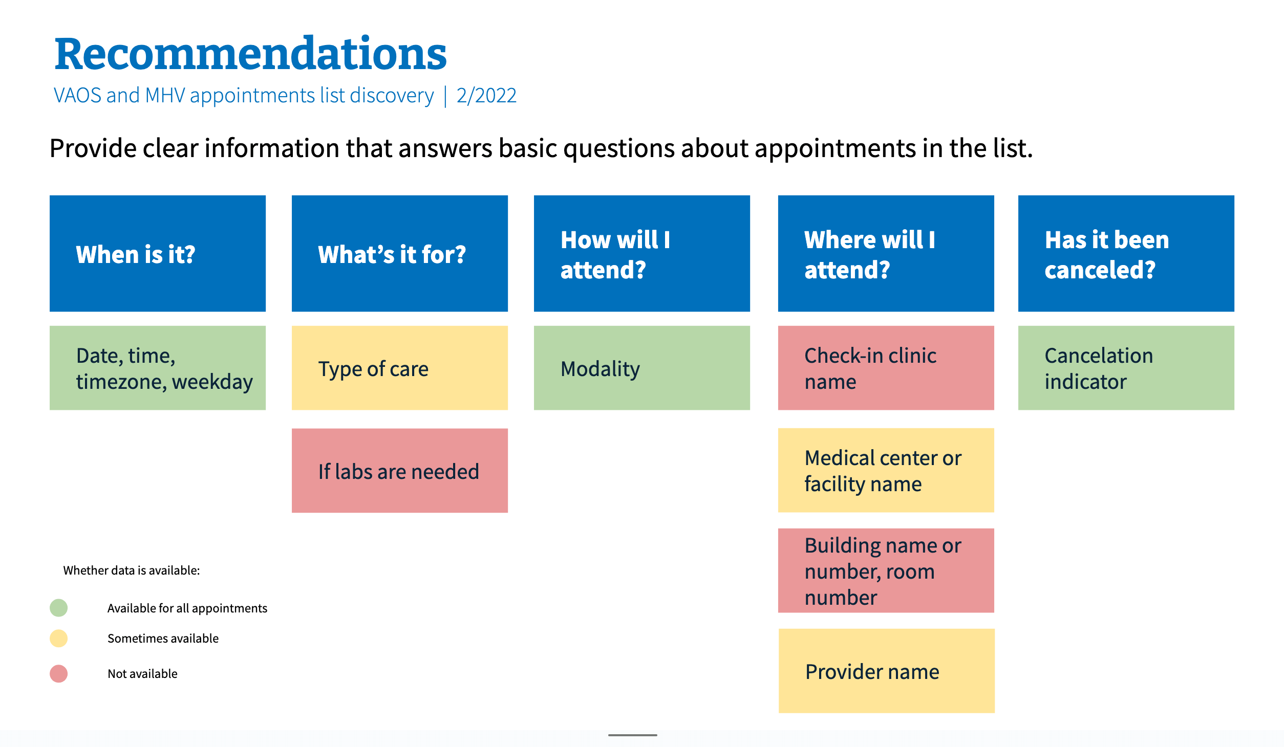
This work gave us a consistent mental model for appointments that provided structure for both the underlying data and how we presented appointments data to Veterans. It sped up future design work as we added more appointment types, as it took the guesswork out of arranging the data.
When we saw a massive new influx of users we received positive input about the tool and appointment structures.
